Unit 20 – D2 Justification
Introduction
This will be a justification and review of what I did for my Unit 20 drink campaign and how it met the clients brief as well as stand out on its own. As presented, we were tasked with making an advertising campaign for a new healthy fizzy drink product made up of all-natural ingredient. The target audience is required by the client to be around 16-25 years old, unbiased on gender and featuring a culturally diverse range of people. In order to create an efficient marketing campaign, it’s important to consider what forms of advertising should be used, especially depending on the audience, what the theme and aesthetic is for the created brand and how it all justifies with what’s been asked by the client.
My Campaign
The drink brand I have created for my campaign is called
Squack. It is an all-natural drink brand which is said to be created by the
juices squeezed out of rubber ducks. The name of the brand is a play-on-words
with “squash” which is an informal word for a fruity drink, and “quack” which
is the noise a rubber duck commonly makes. What I believe sells Squack at its
core is the absurdness of the premise. Think of it. A drink conceived by small
plastic bath toys devouring the desired flavored fruit, taking a bath and then
being squeezed to death. This strangeness makes it stand out from all the
normal and mentally sane drink brands and creates an effective and memorable
mascot suitable for all ages.
My campaign includes a vivid, saturated colour scheme which
pops out on any platform, with its main colours being yellow, blue, orange and
black, all of which are colours that are found on a rubber duck. These colours
are also effective in bringing an energetic summer vibe to the brand which
therefor makes the drink feel fresh and appealing. The logo for my drink is a
rough outline of a rubber duck with an oval eye in the middle of its head. The
simplicity of the logo will help it stand out no matter where it’s used and
make it easy for those who see it to remember as the more complex an image is,
the less memorable it is to the eye.
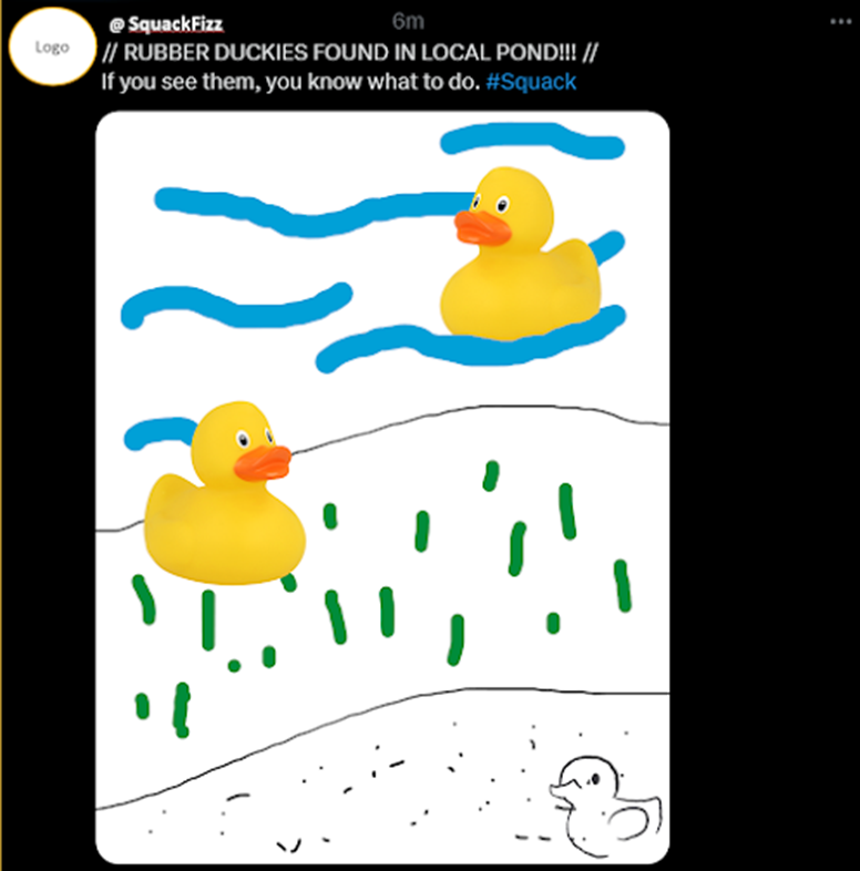
The imagery of rubber ducks and rubber duck eyes is constantly used in the advertising and branding of the drink as well as on the cans, to the point where it’s almost invasive. My main objective was to make the rubber duck a memorable figure and engrave it into every head that sees it. The rubber duck is already a strong, universal image that is known across the world which makes my brand in itself is extremely effective.
How it compares to the client requirement
The target audience is one major factor in which my
drink varies in theme and advertising. Despite the client requirements specifying the drink to be for an older audience, I decided the best way to avoid missing that target is to appeal to all ages. The modern, minimalist look of the advertising and branding makes the drink feel mature but contrast with the quirky nature of the duck to create a comedic tone that's amusing for older groups. This simplicity also applies to how inclusive it is, as anyone of any gender, orientation and ethnicity can mutually agree that ducks are cute and weird. The advertising doesn't waver to anyone specific and tries to be neutral on all terms aside from the fact that it's themed on ducks. An older audience may also find the dark humor of the ducks being squeezed for their juices amusing in itself
The appearance is another factor that can be considered in the campaign. I felt the best way to target an older demographic would be to make my drink as generalized as can be but also with a quirky twist. The imagery I used was effective for my campaign's target audience because they will find it cute, weird and fun, which is a popular them among young adults who want to feel like a kid again. The usage of a toy rubber duck sends a psychic wave of nostalgia to a young adult's head, who probably had one when they were little. This relatability help markets the drink to an even wider range of young people of many possible cultures and origins who can all remember owning a rubber duck of their own or even liking them to this day.
The form of advertising is the main factor of the advertising campaign as it determines how the brand will spread to the target audience. A lot of older people go outside more often than younger or elderly. This can be to get to work, school or just to meet up with friends. This is why I chose billboard advertisements to be my main method of promotion. They can be placed anywhere (depending on the formatting) and can be seen by anyone in the public. There are also much more creative opportunities with advertising with a billboard than most other methods, however, I just stuck with a basic advertisement as to keep it simple and humble. This also factors in where these billboards, as it can range from a bus to a skyscraper or a town to a city. However, this also means that the advertising has to be for all ages as anyone could see these advertisements. I also uses web-advertising as an alternative because it allows anyone who can't possibly see these advertisements in real life to see them on their devices instead (a win-win).
Final Product Compared to Pre-Production Documents
Throughout the creation of my campaign, there's been a variety of ideas and documents created that have progressed the production of my advertisements, some ideas never used and some almost identical to the finished product.


Comments
Post a Comment